Transitional Transformation
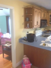
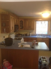
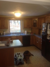
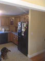
 It’s the tale of woe once again for someone looking to get rid of their 80’s oak cabinets. Especially to a young couple who just moved into a new home. This is one of those stories of a young couple taking on that task (with a smile) to rid their home of those outdated, blonde oak cabinets. These are the types of transformations that are fun.
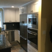
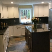
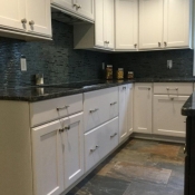
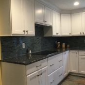
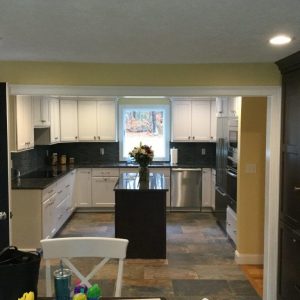
Look isn’t always the culprit with remodeling a kitchen. A lot of it has to do with the layout. With all of the choices in appliances now, for a young couple who likes to cook, this is where they can have fun. I find that a lot of young clients like to go with the sleek look of a cook top and locate an oven somewhere else in the kitchen. In this home, the oven and a microwave went directly opposite the cook top, right next to the fridge. It gave a nice, built-in look. Now two people can work in the kitchen together, and not bump into each other.
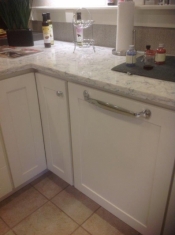
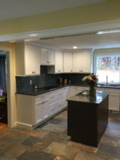
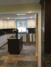
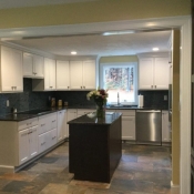
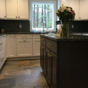
A nice, counter-depth fridge gives the fridge a sleek look. An island was added to give that extra working area where food prep can happen. Like most U-shaped kitchens, we have two corners. In one corner, we put a super-susan cabinet and the other was boxed out to widen the cabinets that go to the corner. It was tighter on the right corner with the dishwasher. So it was better to kill the corner completely so that it doesn’t cut up the cabinets coming into it.
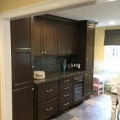
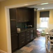
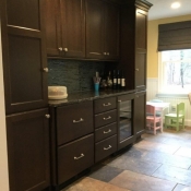
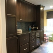
Like most people, utility cabinet space is a must. We took a wall in the table area and put two pantry cabinets with a beautiful bar/cabinet area in between. This also gives it a nice built-in look and plenty of needed pantry storage. When you are dealing with a tight area for the kitchen, it’s important to utilize every open space to make the kitchen better. The cabinets that you pick should have great options for better storage, such as trash cabinets, drawers and pullouts. Bringing the cabinets to the ceiling not only gives you more storage space but also a nice built-in look.
The cabinets chosen were Omega’s Dynasty Series in a White Opaque and a rich, Dark Kodiak finish on Cherry for the pantry/bar area and island. The dark with the white cabinets give the room a pop. The door style chosen was the beautiful, sleek looking Renner door, which gives a nice transitional feel. Beautiful Blue Sapphire counters topped off the look, giving the counters a very rich feel. A bold, dark glass tile gives a richness and modern feel to the space. Stainless knobs and handles accent the cabinets and match the stainless appliances.
Change is always tough when starting the process of remodeling a kitchen. I find a lot of clients wanting to take that step but they need help putting it all together. I also find that they have a lot of ideas in their heads and it’s our job to ask the right questions to get it out of them. That’s where the Dream First process helps in letting the ideas flow.
Do you know of anyone struggling with the decision to take that step towards remodeling their kitchen? Help them by sending them to our website to download the Dream First book. It will not only help them get started but also help get their project going with a professional.
Dream First and everything else will come together!
Bon Appetit!
Tim
(Food A Holick)
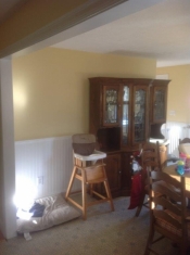
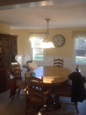
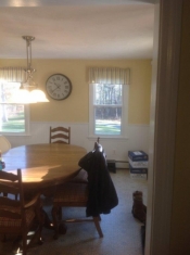
Before and After:
This entry was posted in Kitchen Remodeling on .

