Traditional Treat
 With all the transitional style crave out there, I decided to highlight the traditional theme this month.
Nestled into the Pine Hills in Plymouth, this charming home was a pleasure to help create the traditional style that she longed for. The Pine Hills is a large community for a lot of people who want to retire and when it comes to their homes, it’s all about luxury and pampering. I still remember my client saying; “Boy Tim, you really captured the look rolling around in my head. It’s more than I could ever had imagined!” As a designer now in this trade for 40 years now, there isn’t a better compliment to be had.
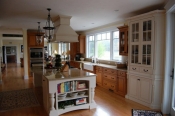
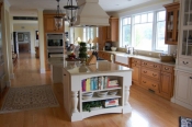
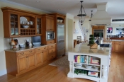
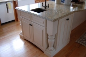
There was a lot that my client was trying to fit into her large space. A hutch, large, chunky island and a desk and bar area were tops on her list. It was determined that different colors of finishes were to be used. She wanted the island to be large and look like a furniture piece. There were a lot of wants so we really needed to put our creative juices to the test. A large space is a dream but if you don’t blend it together right, it will look jammed and out of sorts. We were up for the challenge!
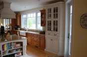
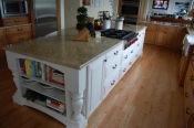
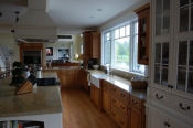
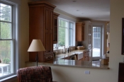
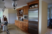
We decided that the best place for the hutch was on the end of the sink wall, to the right of the window. We dressed it with some beautiful half leg pilasters with long, mullion glass doors at the top. We matched the color of the painted island on this piece. The island housed a 36″ commercial cook top, so a beautiful, decorative wood hood provided the needed venting and added to the look and charm of the kitchen. Large, carved legs anchored each corner end of the island with an open book case on the end. An arched overhang on the back side provided room for three stools and added some dimension to the space.
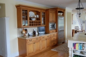
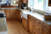
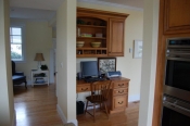
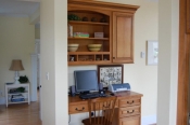
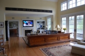
The bar area on the middle wall adjoined the fridge and microwave to give it a built-in look. The desk provided the space to sit and get work done. Retired doesn’t mean we don’t have something to do in our lives. The double ovens anchored the end of the run that opens into the living room, giving a nice, framed-in look to that room. She chose a farmer’s apron sink so we bumped out the sink cabinet and put the half post pilasters there to compliment the hutch.
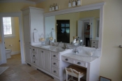
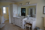
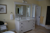
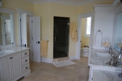
They chose a glazed, maple cabinet in a raised panel for the main kitchen and went with the glazed, painted cabinets on the island and hutch in the Omega, Dynasty cabinets. Beautiful Vyara granite was her choice on the counter tops. She chose the glazed painted cabinets in Omega in her master bath with stunning white Carrara marble counter tops. Her bath was like a spa when she was done.
All in all, I think the spaces came together well, pleasing her wants and needs. She was the quintessential “Dream First” customer who left everything she had on the table, to help us create the space of her dreams. It was a fun project that let us be who we are, and we gained a friend and client forever in our hearts!
Bon Appetit!
Tim Holick (Food A Holick)

