Refined Modern Farmhouse
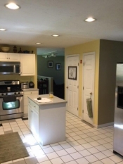
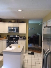
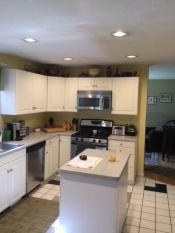
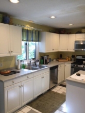
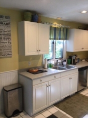
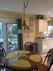
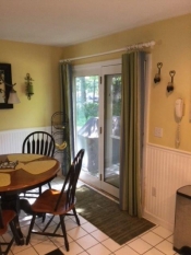
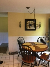
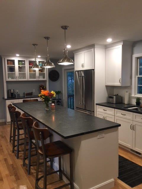 The typical colonial home has a small kitchen with a table area just off of the kitchen in the area where the slider is to get to the back of the home. Most of these homes have a separate dining room. Today’s families are looking for a kitchen that they can cook, entertain and make a statement in. They have worked hard over the years to keep the roof over their family. There comes a time when they are tired of the old cabinets and the cramped space where counter room is at a premium. Most people have an inkling of what they would like for their new space but haven’t a clue how to put it together. This is where my clients come into the picture.
Like most people today, these clients were pretty much done with their kitchen and the way it looked and performed. Thoughts of the newest and coolest appliances crept into their minds. I think that is where most people start. Stainless steel, commercial-looking appliances are the rave these days and they wanted a new kitchen to compliment them. We met at our showroom first, and lots of thoughts and ideas flooded our minds. This first meeting is paramount to getting a feel for what my clients like and where their thought process is going. They were pretty sure of what they liked and didn’t like, so it made my job much easier. Cabinets and counters were chosen and now we were ready for some design ideas and plans to be generated.
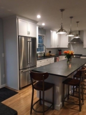
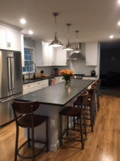
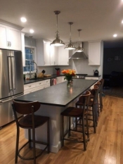
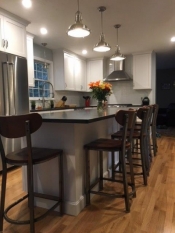
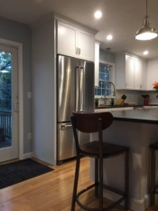
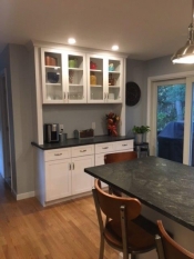
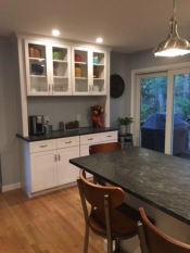
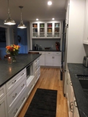
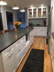
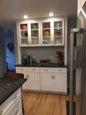
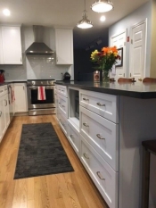
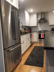
Their first thought was to get rid of the table area so that we could incorporate a much larger island that would go into the now empty table area. When combining two previously separate areas attention must be paid to the proportions of the overall space. We designed a nice bar/hutch area on the bathroom wall next to the slider. This helps finish off the look with the longer island. Since the table was gone, 5 stools were planned to fit in the island for most, everyday meals. The fridge used to be on the center wall of the house, making the main pathway through the kitchen cramped. We chose to put that on the sink wall before the slider, which made better sense. We did talk about possibly putting deep cabinets on the center wall for more storage, but I felt that with a better designed kitchen, they wouldn’t need the extra space. It also freed up the center path of the kitchen. Chimney hoods are the craze right now, especially in a modern, farmhouse setting, so that is what they chose to top off the beautiful, commercial looking stove.
Refined modern farmhouse, classic and simple lines were the words being spelled out to me, so a simple shaker door style seemed to fit the look perfectly. Omega Benson door style in their Pearl, Opaque finish was chosen for the cabinets. They wanted the classic black and white look so Jet Mist granite in a honed finish fit the bill, giving them that old, classic farmhouse feel like soapstone counters but much easier to maintain. A sleek, stainless handle topped off the look like jewelry. They ripped up the old, white tile floors and put in some beautiful hardwood floors. It not only warmed up the space, it also made the space look larger and blended into the other rooms, which were hard wood already.
The results speak for themselves. The space is absolutely beautiful and they now have a large, party kitchen that they can enjoy for years to come. I have been designing and installing kitchens now for 38 years and when the kitchen remodel is such a huge transformation, as it was here, I’m still blown away when I step foot into the new kitchen for the first time. This was a fun project and hopefully, like many of my kitchens, I will have the privilege of attending one of their parties!
Bon Appetit!
Tim Holick (Food A Holick)
Project Before and Afters:
This entry was posted in Kitchen Remodeling on .

