Raynham Farmhouse Renovation
 This month’s story is one of my favorite home cabinet renovations. It was for two good friends who completely renovated their old colonial farmhouse home. We designed and installed for the kitchen, pantry, bar and master bath.
The theme was to stay with the old farmhouse feel but bring in today’s modern conveniences.
After going through the process at the Boston Design Center with various businesses and designers, they came to me to help them out. Their frustration with the other places was the lack of anyone listening to them, even though it was a home that they have lived in for years.
The home was his parents’ home originally, and it meant a lot to them that someone listened to their thoughts. It’s my job to understand them, so many questions later, I was able to capture enough of their vision to come up with their dream spaces.
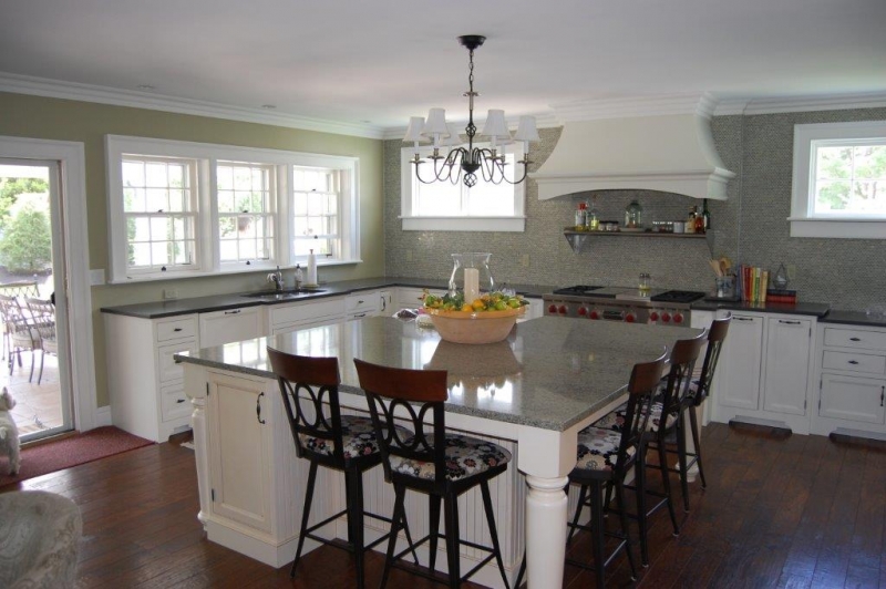
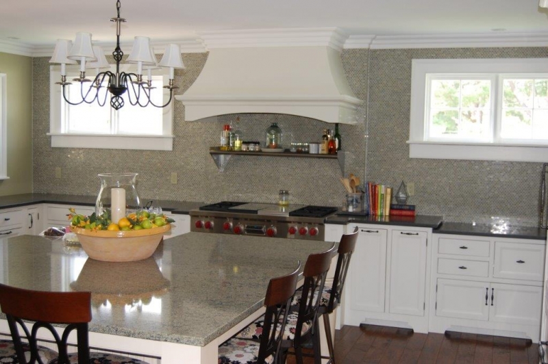
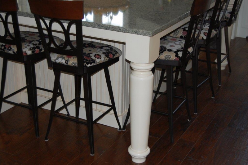
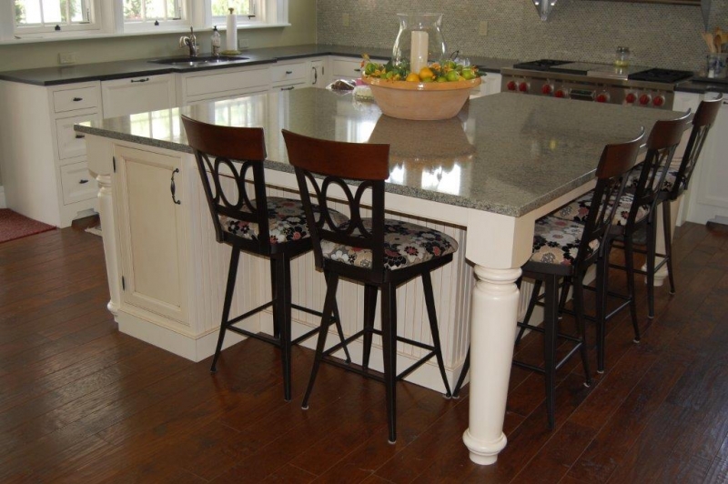
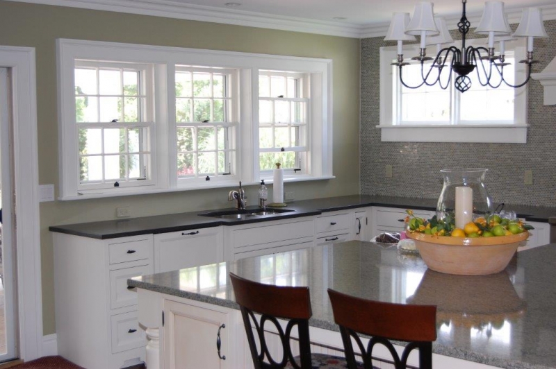
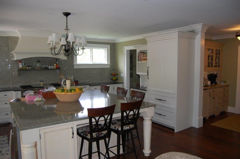
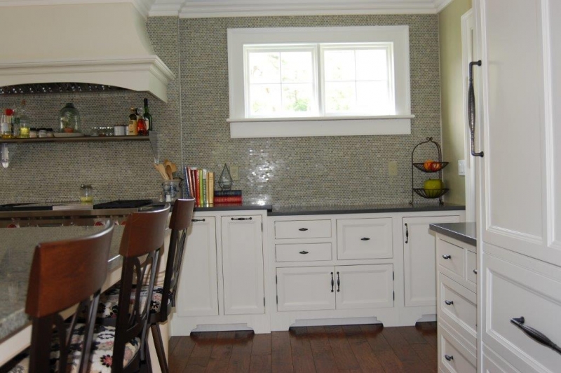
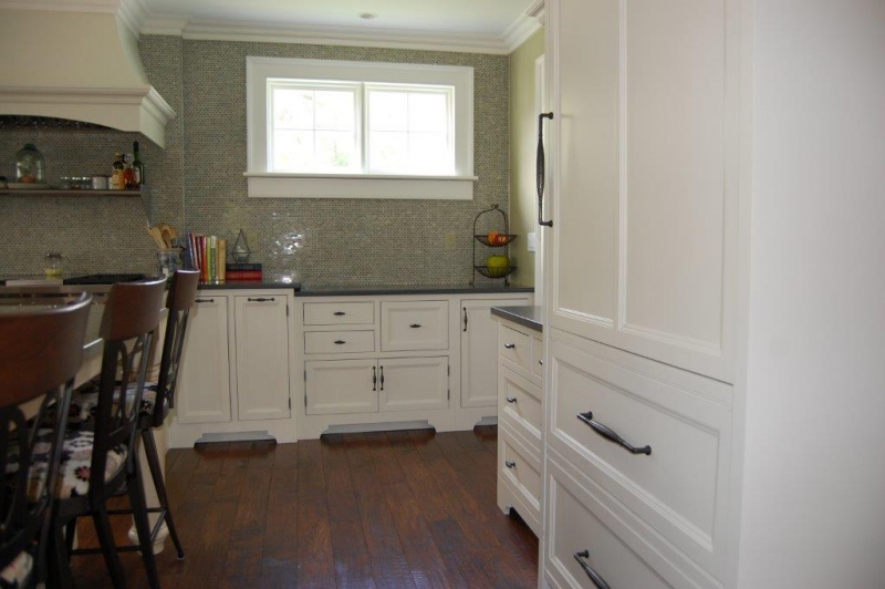
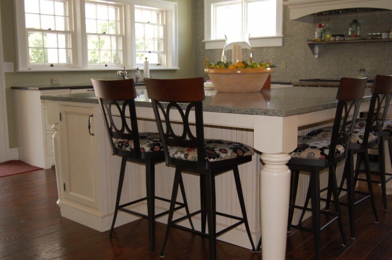
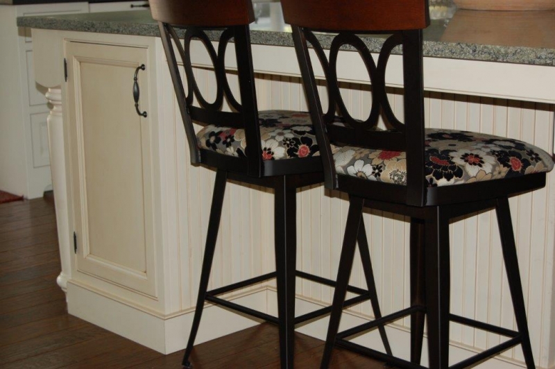
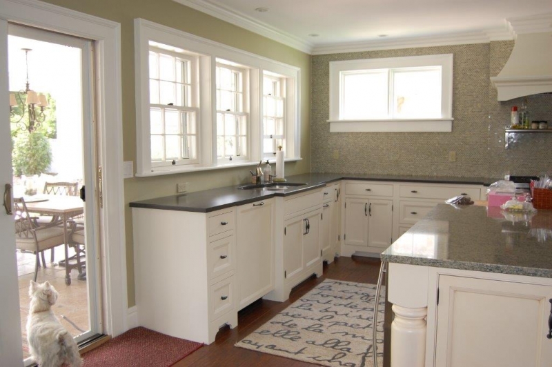
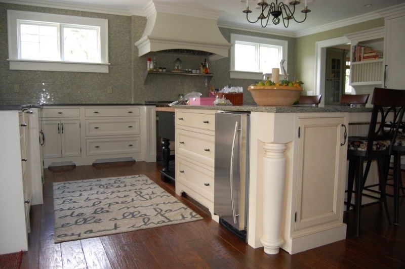
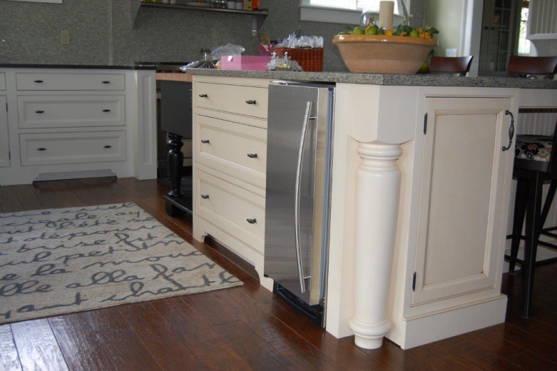
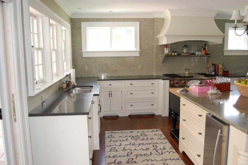
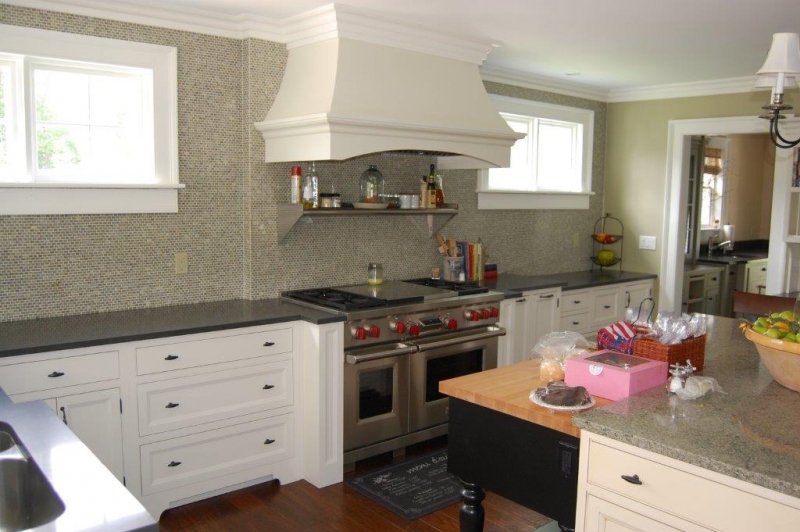
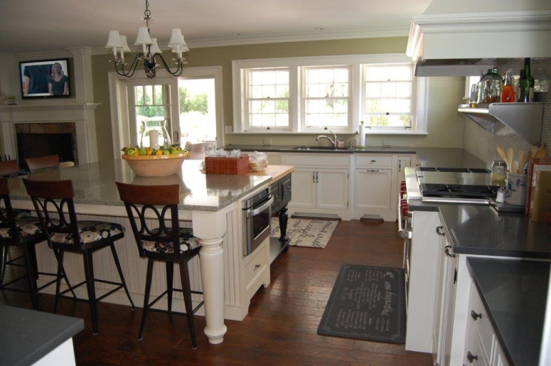
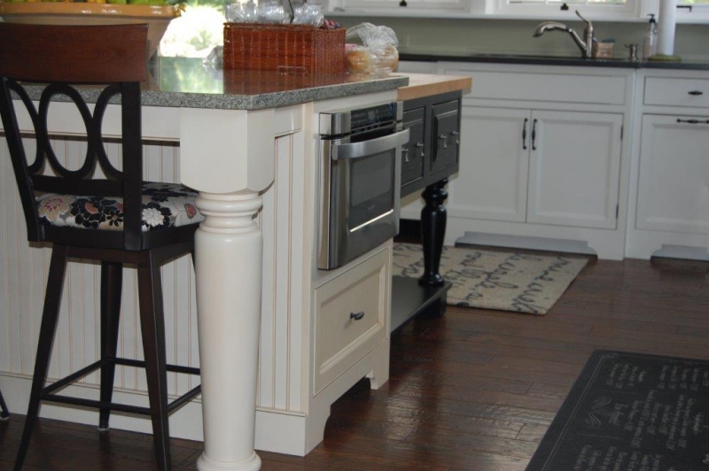
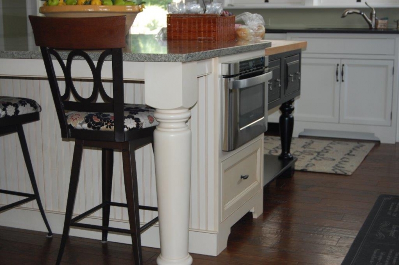
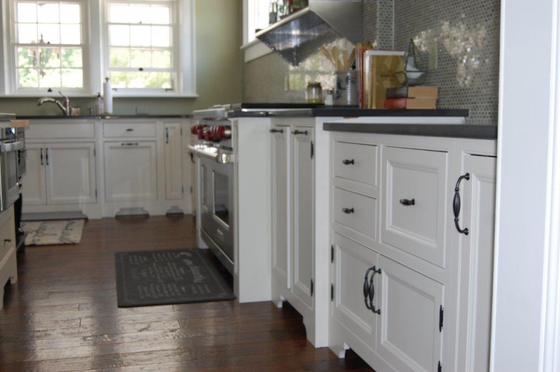
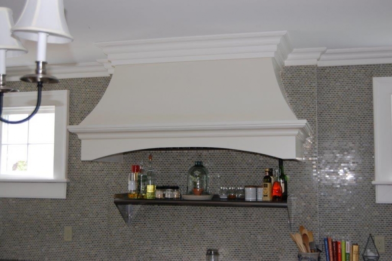
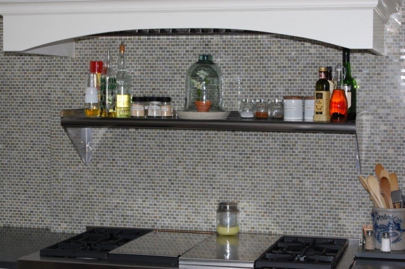
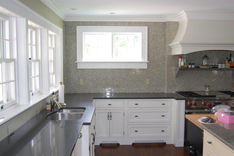
It was common in the older homes to not have many wall cabinets in the kitchen. With a separate pantry and bar room, it made sense to keep the upper wall area clean so that we could accentuate the beautiful, concave wood mantle hood and put as many windows in for light into their space. Beautiful, small tiles were applied to the whole stove wall to give it that older presence that matched the home. A large, farmhouse, country island anchored the room with beautiful, large, ornate legs accenting its presence.
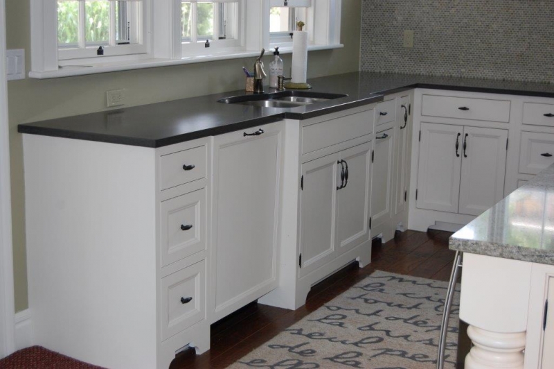
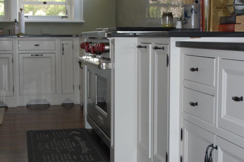
We inserted a wonderful, black furniture island piece in the corner of the island with a versatile, butcher block top, across from the stove and sink area. I have one in my home and find that I use it all of the time to prepare food for the stove or burners. If I need to wash vegetables, the sink is right there also. I love the architectural recessed panels that we used to flank the commercial stove. It fit the look of the outside of the home.
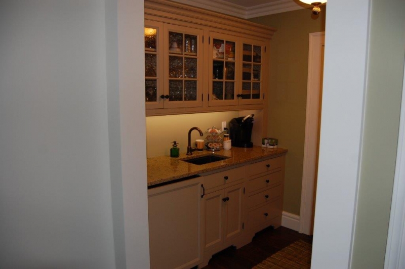
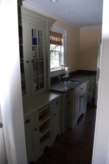
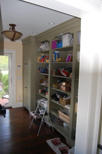
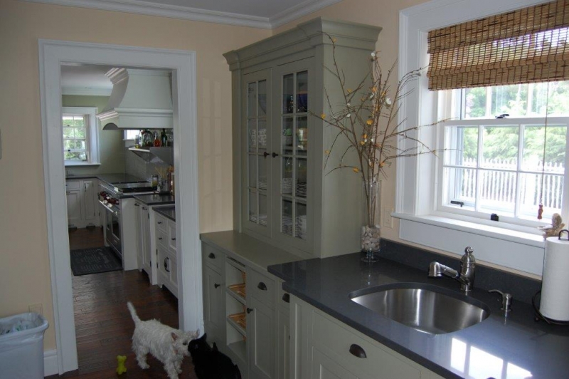
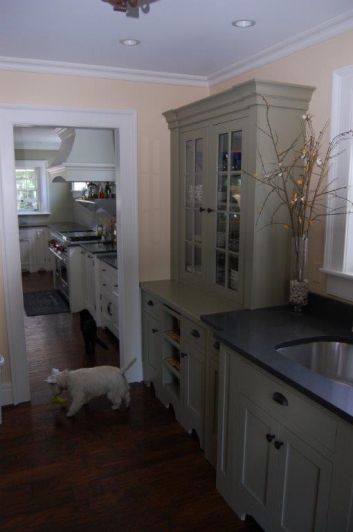
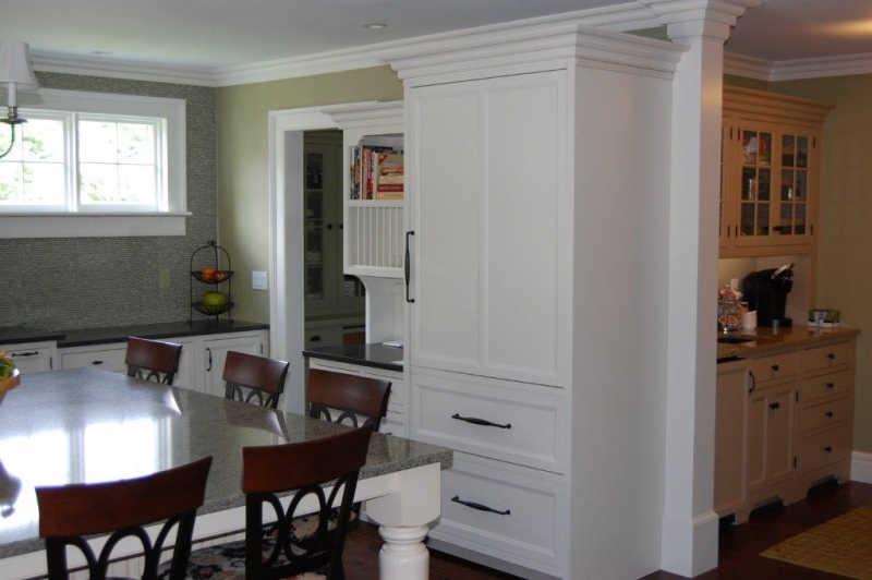
The pantry and bar areas were meant to store the overload of items not wanted in the kitchen. Older homes were known to have these great rooms that added to the charm of the home.
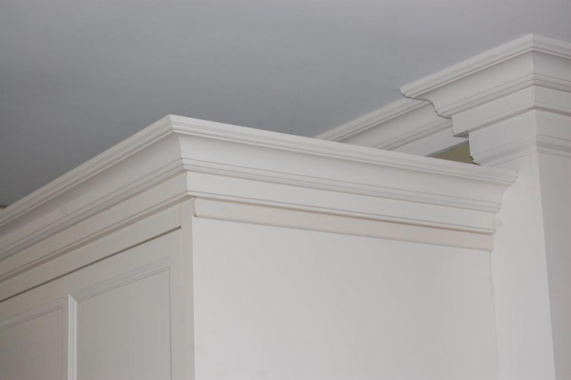
Signature Custom cabinetry in a beaded inset style cabinet with a recessed paneled door was chosen for the kitchen and bar area in a white paint. The pantry area was Omega Dynasty cabinets in a flush inset shaker panel style in a moss green color. Mixing the two styles and colors lent again to the older charm of the home. Never be afraid to mix looks and styles to show your true style.
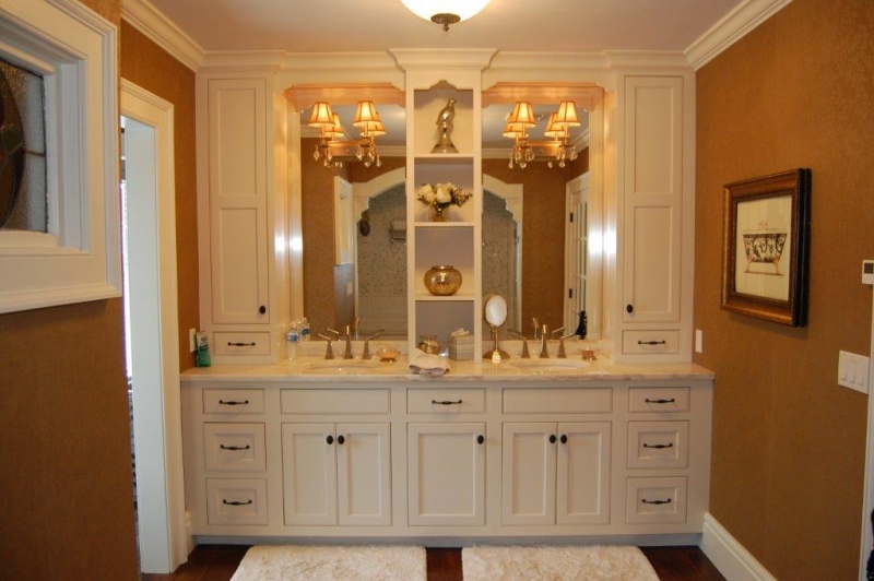
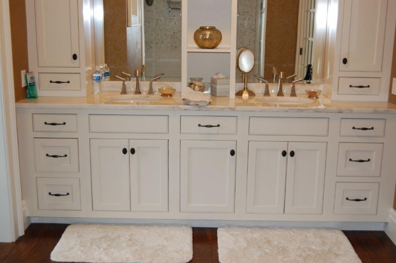
The master bath was in Omega Dynasty, beaded inset with a slight off white paint. The look of the vanity was chosen to reveal a built-in look. Various granite color tops were chosen for each room, again to add to the charm and look of the home.
Overall, the project was a hit, and absolutely stunning. It always comes down to “Dreaming First” so that all of the ideas and choices are on the table, and capture the look that gives you the space that not only works well, but reflects who you are. It was a fun project that I will always have in my mind!
Bon Appetit!
Tim Holick (Food A Holick)
This entry was posted in Kitchen Remodeling on .

