Raised Ranch Restoration, Transitional Style
 This month’s feature kitchen remodel reminds me of my very first home, a small raised ranch in Raynham. I had just gotten married and I was young and full of energy. It was the summer of 1988. I had moved in about 3 months before our wedding. The home needed work, so I pretty much renovated the entire place, inside and out. I think I tore out the kitchen the first week I moved in. I ripped up the floor, took out the wall between the kitchen and dining area. That opened up the area and gave it a much larger feel. This allowed me to create a nice peninsula that I could use as a separation between the dining room table and kitchen, and gave me a nice open area for a slide-in stove. We really enjoyed that kitchen during our first seven years of marriage.
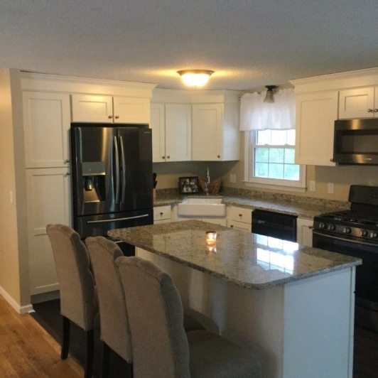
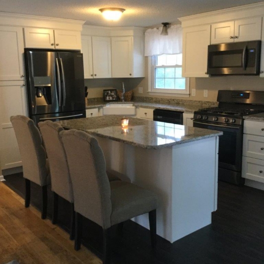
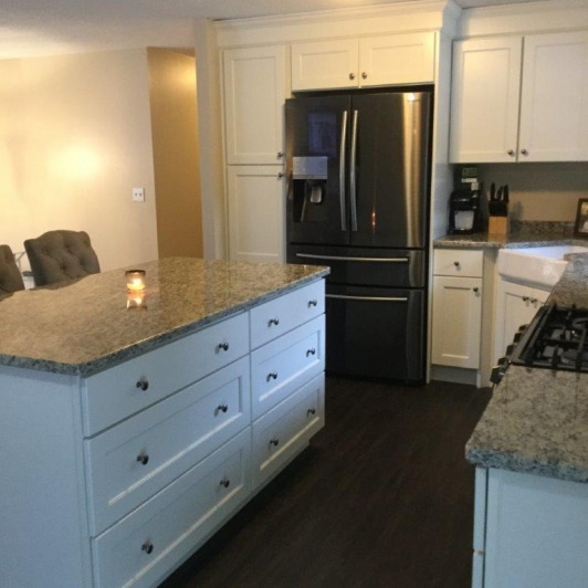
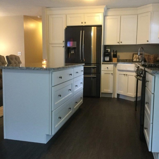
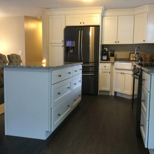
This month’s feature kitchen project went one step further by opening the center wall that abutted the living room and dining area, giving it a completely open look. This left space for an island, which creates a nice separation between the kitchen and living room while giving the clients a beautiful, open workspace and stool area. Islands have been so much more popular in the past 15 years than peninsulas, because it allows easy access to the whole area. It also acts as a great homework and craft area. I love the way it filled the floor space and blended the kitchen and dining room areas.
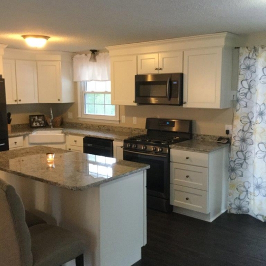
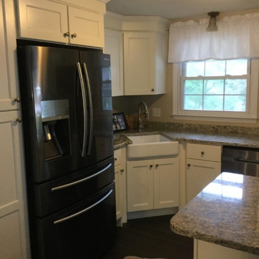
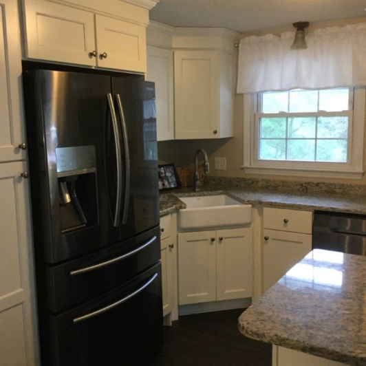
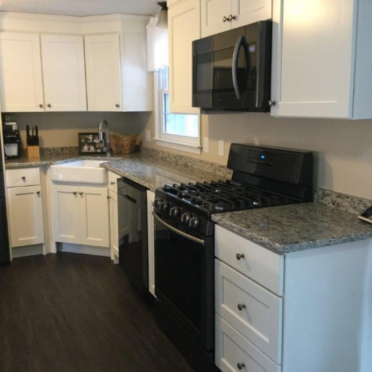
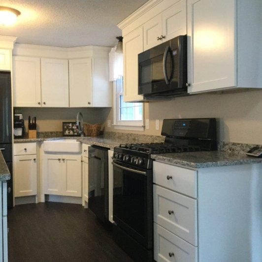
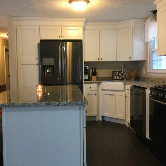
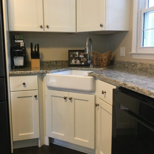
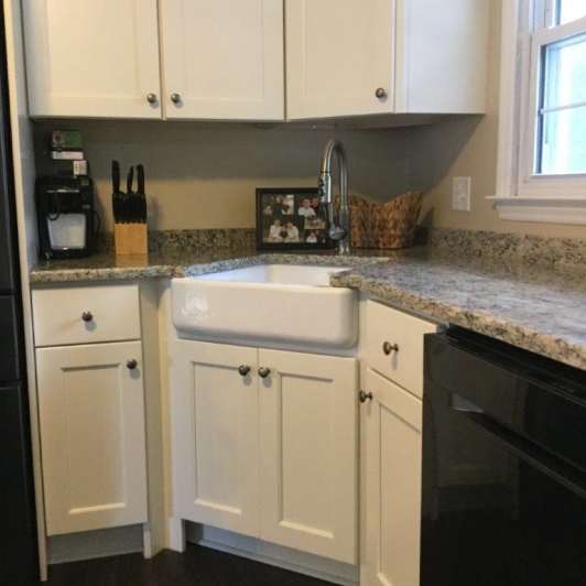
Our clients wanted a transitional design for this newly opened space. To keep it light, we suggested painted walls and cabinets. After much debate between two different colors, our client chose JSI Trenton Ivory Maple cabinets. She wasn’t a fan of stark white so we went with a slightly off white color. Santa Cecelia Light granite was chosen for the counters to help blend the cabinets together instead of a stark contrast. This gives the kitchen a smooth, calm look to keep the area neutral. A beautiful and simple satin nickel knob was chosen to blend with the cabinets instead of sticking out. All these materials accented and blended the warm, dark wood flooring.
When it came to the layout, I came up with a not-so normal look for the typical raised ranch. Normally the fridge is up against the center wall with a stove placed on the same wall. It lends to a very tight work space and keeps the kitchen looking standard. I chose to put in a corner sink since the window was not too far out of the corner. She always wanted a farmhouse apron sink to tie together her transitional, farmhouse to modern taste. I don’t typically put an apron sink in a corner set-up but I made the changes to get one in for her. By putting the sink in the corner, the stove could now be placed on the outside, back wall so that they could vent the microwave outside. The microwave above the stove has a weak fan, so making the transition direct with the vent helps make it work properly. With the island now directly in back of the stove, it’s a win-win for cooking and preparation.
Change is hard for some people, but as you can see from the pictures, the changes we made here created a new, beautiful, efficient space that our clients can cook and entertain in. I would like to thank my clients for letting me help them Dream First. In the end, they got a useful space that gives them convenience as well as a wow-factor when family and friends come to break bread at their table.
Bon Appetit!
Tim Holick

