Modern Southwestern Retreat
 This month’s feature is as different from other months as it could be. One of my favorite projects because I helped with the design of the whole downstairs floor, where the kitchen was sandwiched between two other rooms.
When I first walked into the home, I was amazed at how long the whole area was that housed the stairway, dining area, kitchen and family room. The ceilings were sectioned off with very large, sheet rock soffits. That’s how the original builder and homeowner must have thought that the soffits delineated the rooms. My clients were sick of the wood and the whole wall fireplace stone and were looking for a complete transformation. After seeing the home, I was up for the challenge.
As all of our projects go, it was time for them to Dream First so that I could decipher what they were thinking. I concluded that they wanted a very modern, simple design with the least clutter and fuss possible. I chose modern with a southwestern flair. The thing that I was most perplexed by was the four large sliders that opened into what I thought was the outside of the home. When I opened the doors, they led into a huge indoor pool area that they said they hardly used. It is a massive and impressive room with a beautiful pool. If you thing southwestern, you immediately think of open to the outside. There had to be a way that we could achieve that, I was thinking. I had some brainstorming ahead of me.
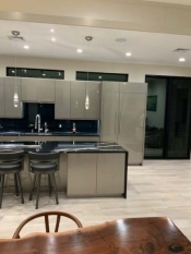
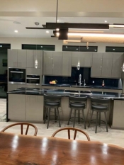
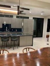
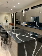
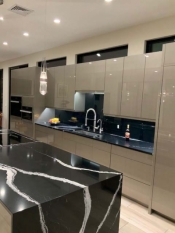
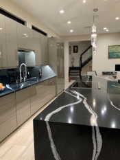
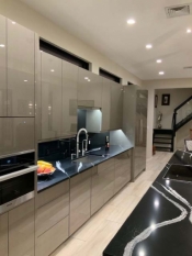
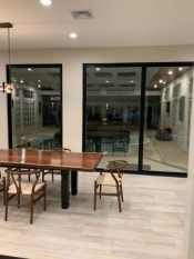
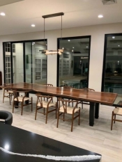
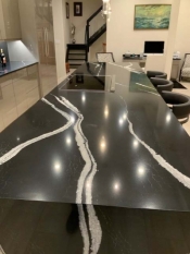
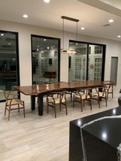
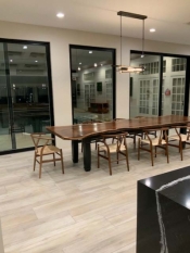
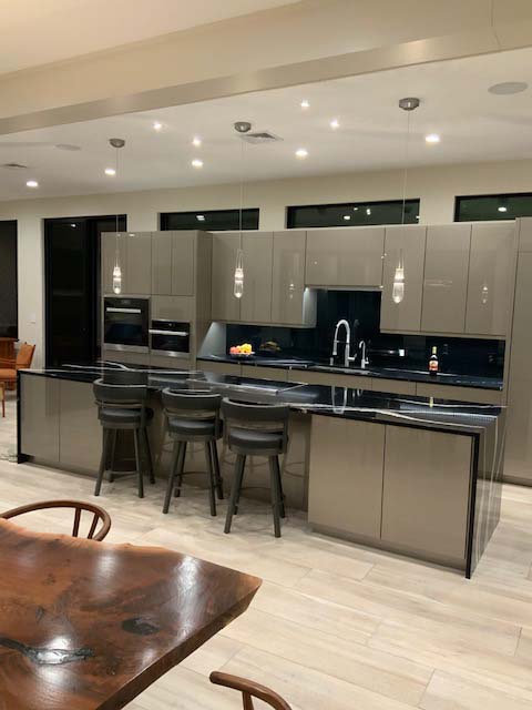
After I sketched the whole area on a graph paper, I started to outline where I thought the kitchen made sense. They were keeping the posts that divided off the rooms and getting rid of the chunky-looking soffits. The posts became my end points for the kitchen. The original kitchen had two peninsulas that closed in the kitchen area and bordered the small island. I decided to open up the area by just having a straight run of walls cabinets on one wall and putting in a long, deep island to fill the area. In this way the island would mimic the table area that we wanted in front of the indoor pool wall. The regular sliders had to go, so we took them out and replaced them with two massive, high sliders on each end with a stationary, low-to-the-floor window in the middle. The view to the pool is so much better with these southwestern style doors and windows. I convinced them to have no window or door casings and do them with a slim lined sheet rock corner which is popular in states in the southwest. This takes your eyes off the detail to appreciate the beauty of the doors and all the windows, and at the same time gives an unobstructed view. I also placed some beautiful, long, low-height transom windows above the straight run of cabinets to open up the look above, while bringing in more light. Transoms are beautiful windows to have close to the ceiling like that.
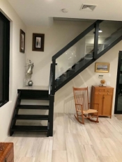
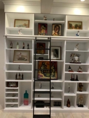
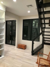
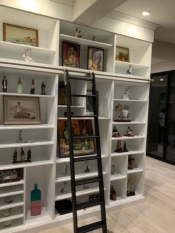
We brought in an architect friend of mine to survey the room length and come up with some thoughts to break it up. She came up with the great idea of putting up a wall to section off the entrance and stairway,thus making a separate entrance room. This gave us two walls to house a desk in the kitchen and a large bookcase in the entrance room for a few small items and beautiful paintings from around the world that they have purchased over the years. She then suggested sheet rocking most of the large stone wall around the fireplace, leaving just a small area with the stone. We placed two long base units on either side of the fireplace to fill it in and give them some storage. They kept the stairway but opened it up by using glass panels as railings to complete the modern look. They stained the oak in a dark, black finish to go with the glass better.
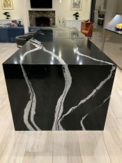
The cabinets chosen to give her that sleek, modern look were Ultracraft’s frame-less line with a slab door style in a Silver Ultralux finish. We did not want to take away from the suppleness of the door, so we didn’t use any hardware. Instead, we used push pins on the doors and drawers. Beautiful quartz counters in Cambria’s Mersey color in a mix of matte and shiny finishes topped off the cabinets like fine jewelry. It’s a striking color, as you can see in the pictures, with beautiful, white streaks of color. We chose waterfall ends on the island so that we could carry that flow of white perfectly in flow with the floor. It’s a dramatic touch to a large island.
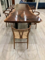
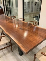
From what once was a custom-made table, we used Ultracraft’s beautiful leg details with a Cambria top to coordinate with the Mersey counter tops, and changed to a beautiful one-piece walnut top with live, bark edges on the top, replacing the quartz. The results of that top are nothing short of breathtaking. The wood gives a nice accent to all the hard colors used on the cabinets and counter tops. This table top fit in perfectly with the southwestern flair.
When I visited the home recently to see the results and take some pictures, I was pleased by the feel of the whole area and the happiness on the faces of my clients. Not only did it give them the feel that they longed for, but also the two large sliders on the wall to the pool area now gave them a view of the pool and made it feel like it was more open and accessible to the living area. They told me that they now use the pool room all of the time to sit in and relax, and also swim more often. They feel like they are always on vacation now when they get home from a busy day. They can relax and enjoy this spectacular area with their family. Isn’t that why we work hard?
Bon Appetit!
Tim (Food A Holick)
Before:
After:
This entry was posted in Kitchen Design, Kitchen Remodeling on .


