Cape Cod Downsize
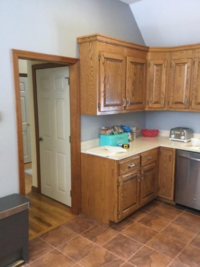
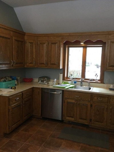
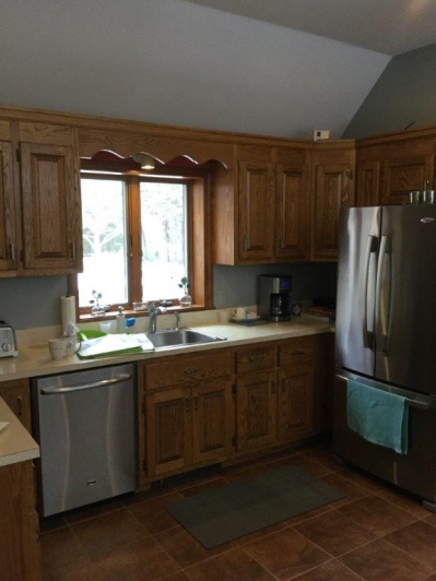
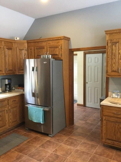
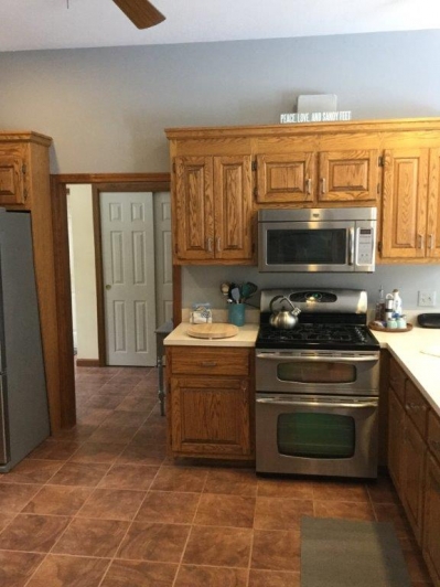
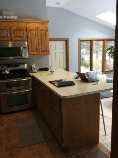
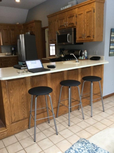
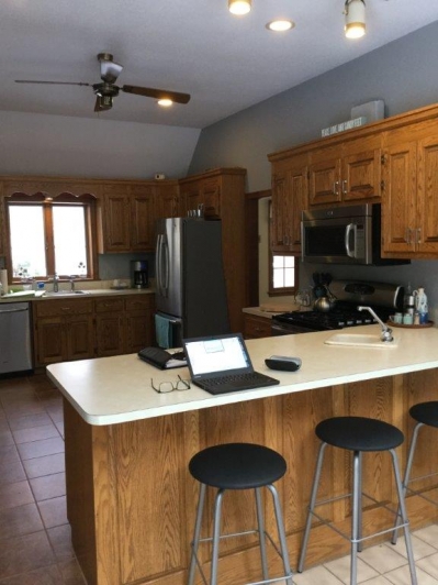
 So many baby boomers are selling their larger homes and moving into a cozy beach home on the Cape in the Cape of good Cod. Falmouth was this couple’s choice to retire in this Cape Cod Downsize. The kitchen was the typical outdated ’80s kitchen. Light oak with a raised panel door were the rave in cabinets back in the ’80s. Unfortunately nobody wants it in their homes anymore. Not only was it outdated, but the layout didn’t work either. Being clients of Wood Palace over the years, they came back for their 3rd kitchen remodel when they did their Cape Cod Downsize. They are used to Dreaming First so the choice was easy for them. A lot of changes were to be made so we didn’t waste any time coming up with a design using some of today’s materials.
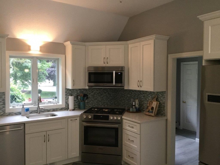
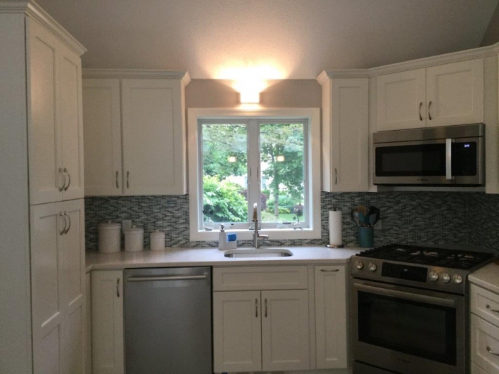
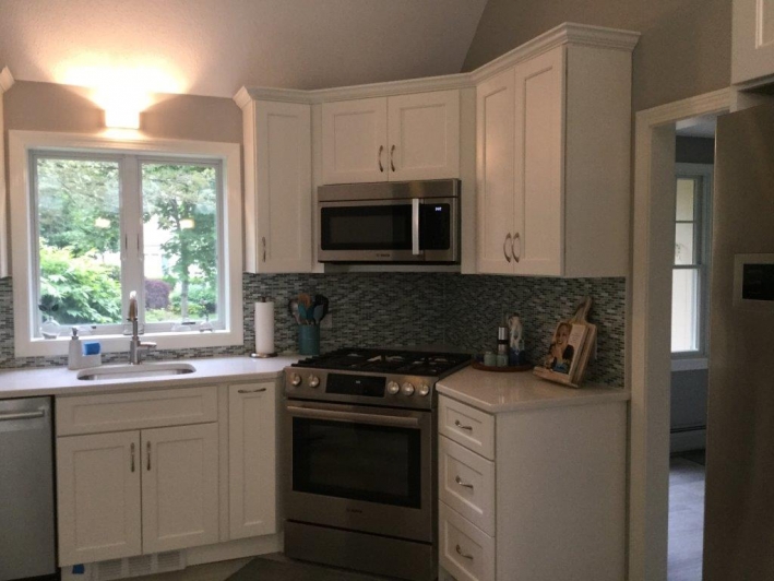
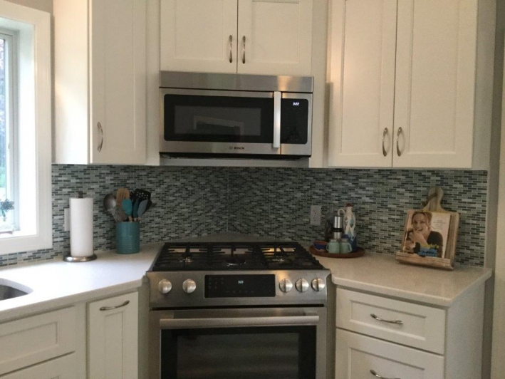
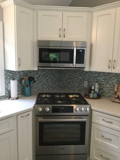
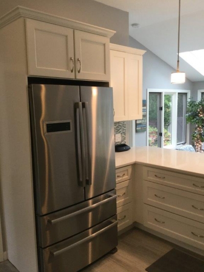
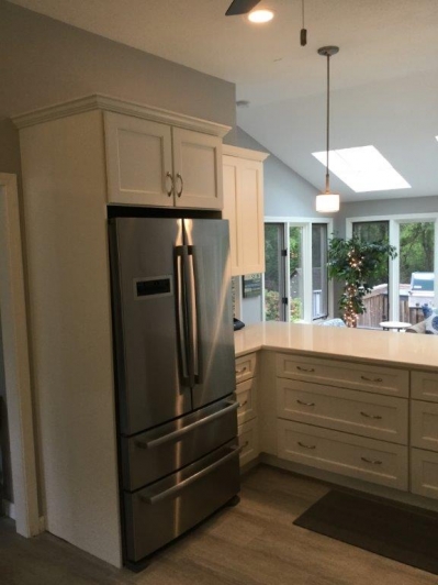
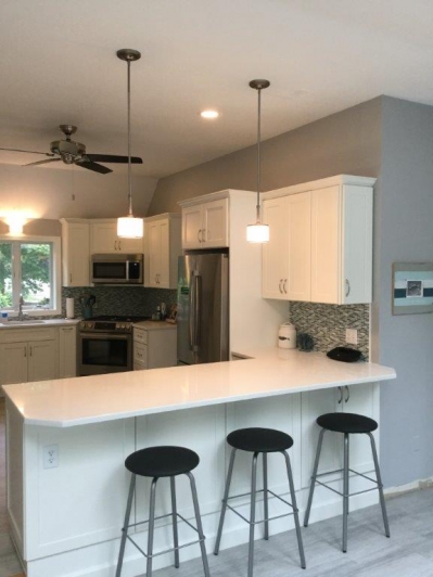
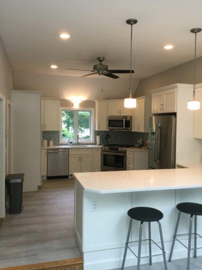
First and foremost, the layout needed to be brought into today’s world. With two doorways and a drop down to the table area, long, straight wall space was at a premium. The only way to solve this is to come up with a corner sink or stove. The corner stove won out. By taking a stove and throwing it on an angle, you free up your straight walls for other appliances. The fridge was crammed into the corner in the old design, which abutted a doorway. It looked cramped and overpowered the area. By putting the stove in the corner, it freed up the wall that the stove used to be on. It also put the stove closer to the sink and main work area.
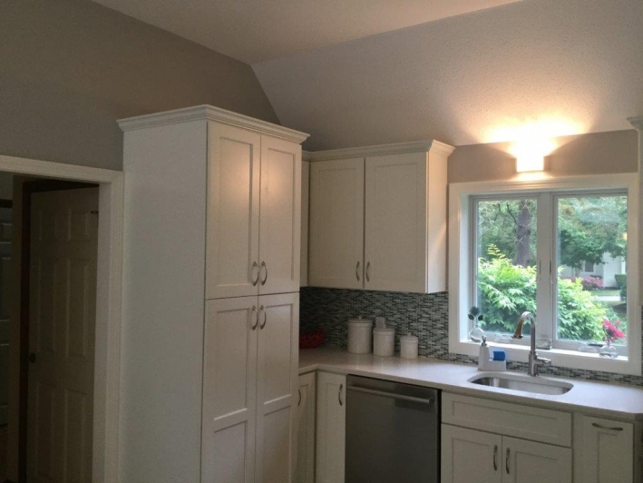
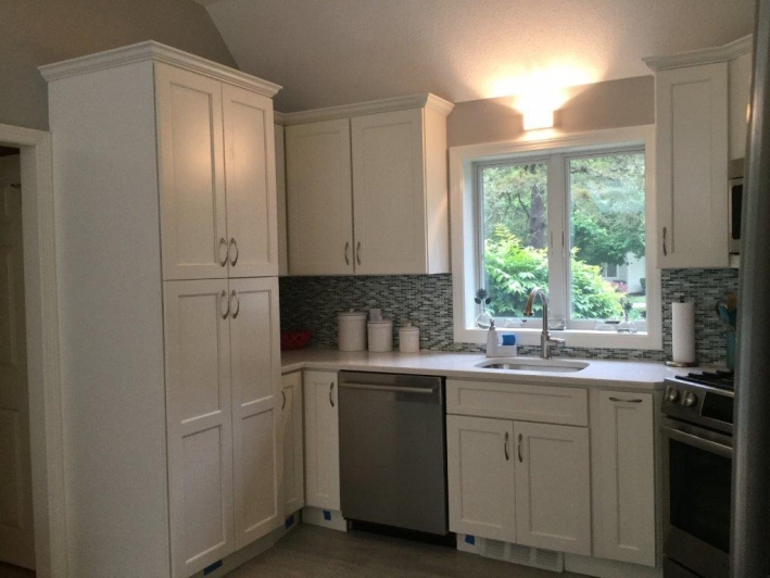
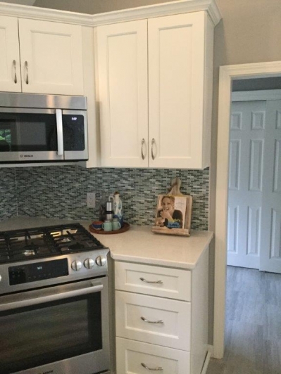
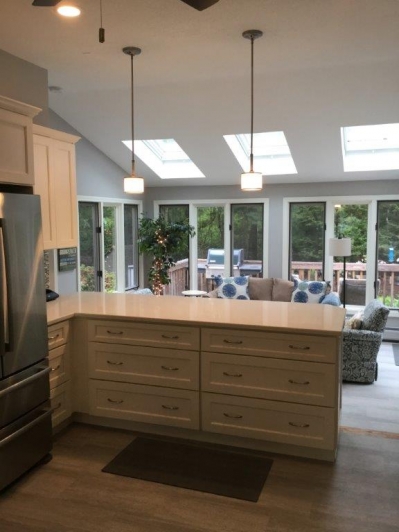
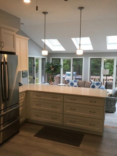
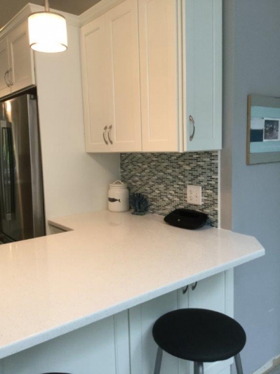
She needed some larger storage so we squeezed a tall pantry cabinet on the wall to the left of the sink wall. It gives the corner a nice built-in look. There are rollouts in the bottom section for ease of seeing and grabbing food. We kept the peninsula on the area that drops down to the table area. Larger three drawer cabinets were chosen for easy access to storage. The left of the stove housed a pullout spice base for all of her spices and oil bottles. Beautiful door panels were put on the back of the peninsula to look like the real door cabinet to the right of the stools. The layout not only works but gives the area a better look. Most clients today want that “now look”. Clean classic lines are favored over the old chunky feel.
Cabinets chosen were an economical choice, JSI Cabinetry in their Trenton Recessed off-white paint. Counter tops were a very neutral color quartz. Beautiful, colorful glass, strip tile was chosen for the backsplash. It brings that modern feel into the room. I love the pendant lights chosen over the peninsula. It warmed up the area. Flooring chosen was a strip vinyl floor that not only looks real, it will help with the wear and tear that the area will receive during the cook outs all summer long. A beautiful arch-shaped satin nickel handle was chosen to finish off the look.
Over all, the area works well and looks like a million dollars. A downsize doesn’t have to mean sacrifices. The room feels and looks so much brighter and even looks like it’s a larger space. That’s what good design and professional guidance will do for a space. Overall, they are happy with their new space and look forward to not only the parties that they will have, but cooking up a storm fit for a king. We work hard so play time is cherished!
Dream First and everything else will come right into place!
Bon Apetit!
Tim Holick
Before:
After:
This entry was posted in Kitchen Remodeling on .

